€24.00
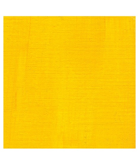
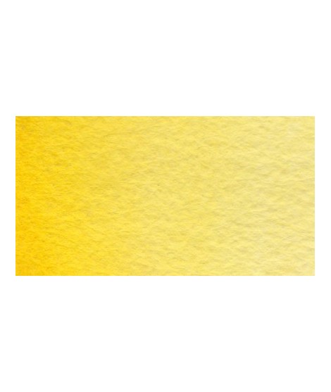
This bright, highly luminous yellow is an ultra-pure colour with a touch of green. This cadmium yellow lemon is a yellow much akin to primary yellow.Â
Active filters
This bright, highly luminous yellow is an ultra-pure colour with a touch of green. This cadmium yellow lemon is a yellow much akin to primary yellow.Â
This is a luminous transparent yellow with the same hue of the cadmium yellow light. Mixed with phtalo green,phtalo blue or indantrene blue, we obtain a interesant range of Transparent green. Mixed with titanium white the result is a very luminous and Opaque light yellow.
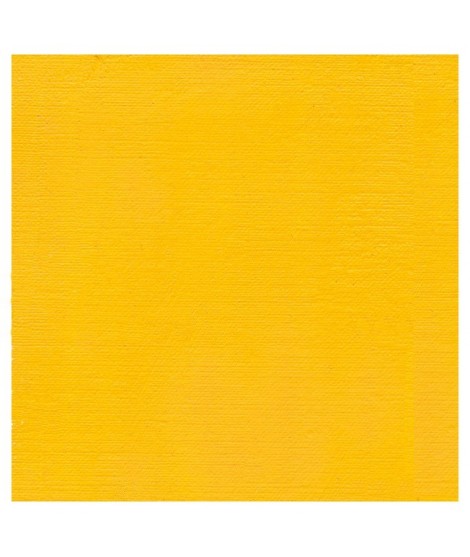
A bright, very luminous yellow with an ultra-pure colour.
A warm yellow wich is very precious to produce warm mixes of all kinds
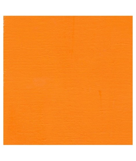
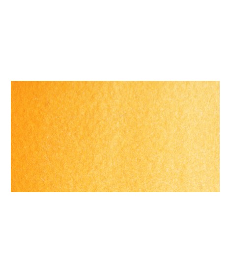
This is a rich orangey yellow. It's the warmest yellow cadmium. This yellow is , such as all cadmium, bright, very luminous and an ultra-pure colour.
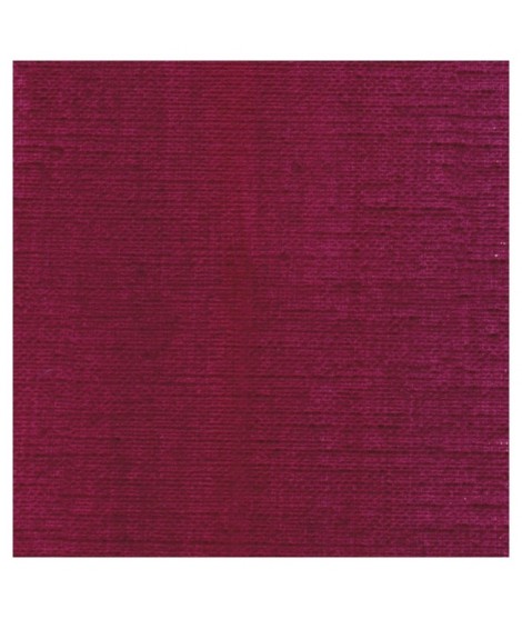
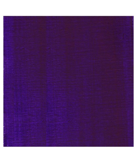
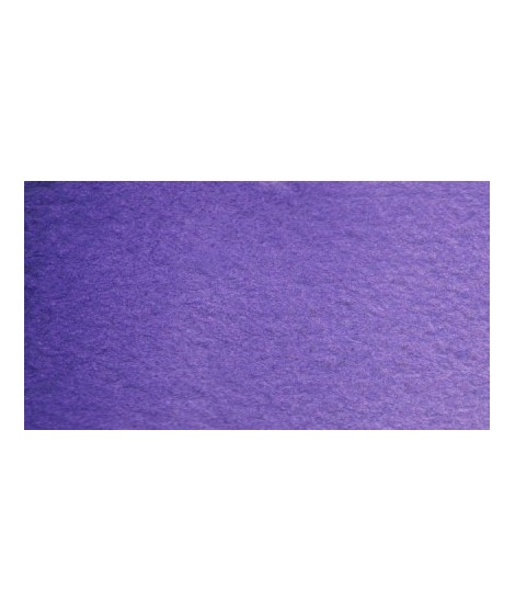
A deep violet with a touch of red
It's a good glazing colour with a subtil and interessant blueish shade. Mixed with white, we obtain a rich range of vivid purple. His tint power is very high.
A strong blue. Mixed with the phtalo green, it produces a luminous range of turquoise.
The bluest of the blues. This blue becomes even brighter when mixed with whites. Very useful for mixing.
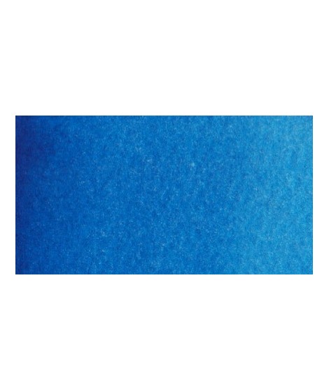
This splendid greenish blue is used to create very beautiful range of greens.
This blue is very drier-reactive, accelerating the drying power of the colours with which it is mixed. Tint power is extremely strong.
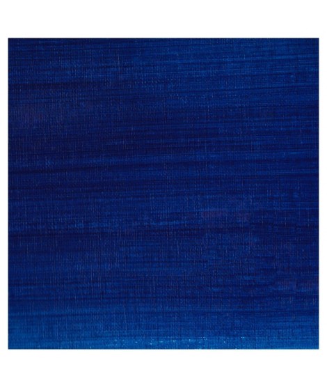
A splendid blue with a rich purple blue undertone.
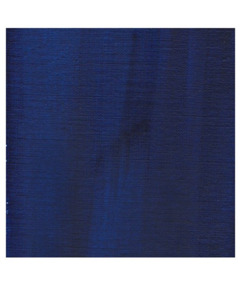
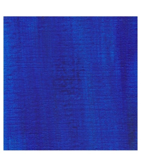
A deep and intense blue with a touch of red.
Very beautiful blue with a shade having an underlying green tone. Very bright and frank.
With phthalo green it forms very beautiful turquoise. With the yellows of the beautiful greens. With the ocher of the more muted greens and with the pink or the purple Isaro a beautiful range of mauves.
Magnificent blue with an underlying shade of mauve. Very useful for composing magnificent mauves, especially with quinacridones like Isaro pink for example.
With black or burnt sienna, it makes it possible to obtain very beautiful Payne grays and with burnt umber to create a beautiful indigo.
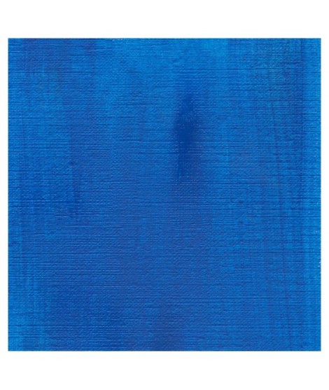
Real cobalt blue with a great purity of tone. Bright and close to primary blue. We can define it as the most blue of blues because it does not draw on green (like Prussian blue) or red (like overseas).
Close shade of natural indigo.
Dark blue with an underlying green hue. This blue is very useful for creating greens, it is actually the blue of greens.
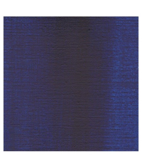
It is a dark blue, which corresponds to a dark reddish blue. It is ideal for nuancing cool colors like violets and blues by giving them more depth. Also useful for forming greens, especially with chartreuse yellow.
Very beautiful yellow, earthy and bright. Very useful on the palette.
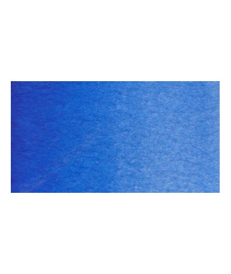
Very beautiful light blue, which pulls slightly towards green. Particularly suitable for working the sky.
A very essential greenish yellow. It allows a wide range of rich and surprising mixes.
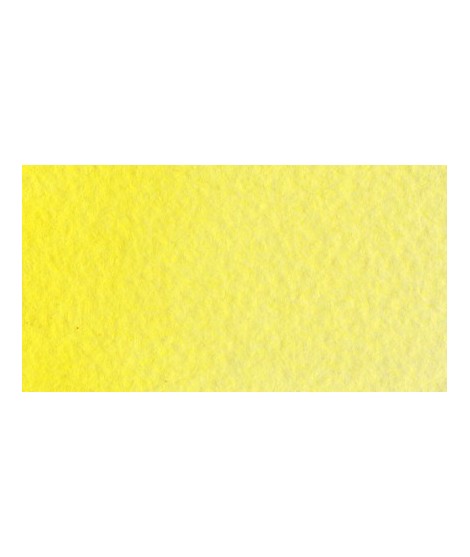
Pale yellow with a slightly darker shade than lemon cadmium yellow. Luminous and bright yellow. Useful as primary yellow. It is one of the essential colors on the palette of a watercolorist.
Magnificent pale yellow with underlying shade of green, very bright and bright yellow.
Warm yellow with a shade close to dark cadmium yellow. With a beautiful transparency, this yellow allows you to obtain a very beautiful range of greens with Prussian blue and Phthalo blue for example. With yellow phthalo green (PG36) it allows you to easily compose the shades "bladder green" and "Hoocker green"
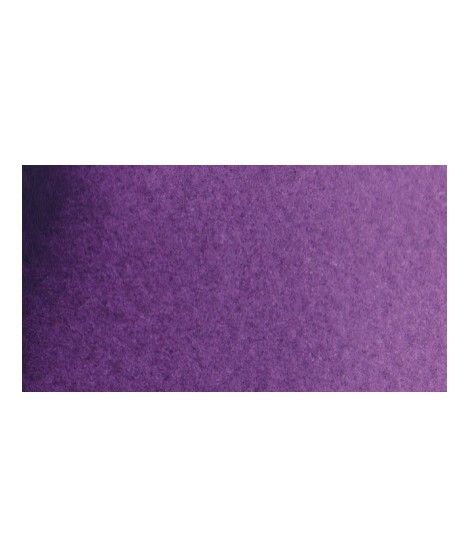
Very beautiful violet with a beautiful purity of tone. It belongs to the overseas family. Its particularity is to naturally granulate.
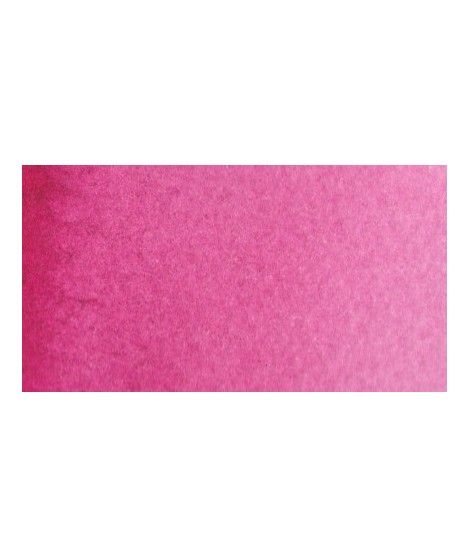
This color can be used as the primary color. It is a bright pink, which forms with the yellows beautiful oranges and with the blue magnificent mauves.
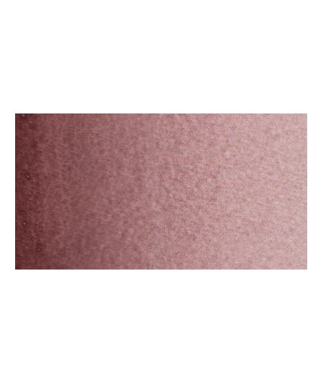
Dark mauve which can be lightened with Isaro pink and nuanced with overseas blue for example.
Very beautiful light mauve mono pigmentary and therefore a beautiful purity of tone. It can be lightened with Isaro pink and darkens with ultramarine blue or phthalo blue for example.
Very beautiful light mauve mono pigmentary and therefore a beautiful purity of tone. It can be lightened with Isaro pink and darkens with ultramarine blue or phthalo blue for example.
Dark mauve which can be lightened with Isaro pink and nuanced with overseas blue for example.
This color can be used as the primary color. It is a bright pink, which forms with the yellows beautiful oranges and with the blue magnificent mauves.
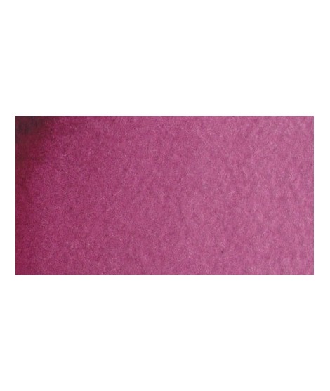
Your dark purple tending to brown. Pure it is of an interesting tone. It also comes in composite colors like sepia brown or Van Dijck brown.
Very beautiful light blue, which pulls slightly towards green. Particularly suitable for working the sky.
It is a dark blue, which corresponds to a dark reddish blue. It is ideal for nuancing cool colors like violets and blues by giving them more depth. Also useful for forming greens, especially with chartreuse yellow.