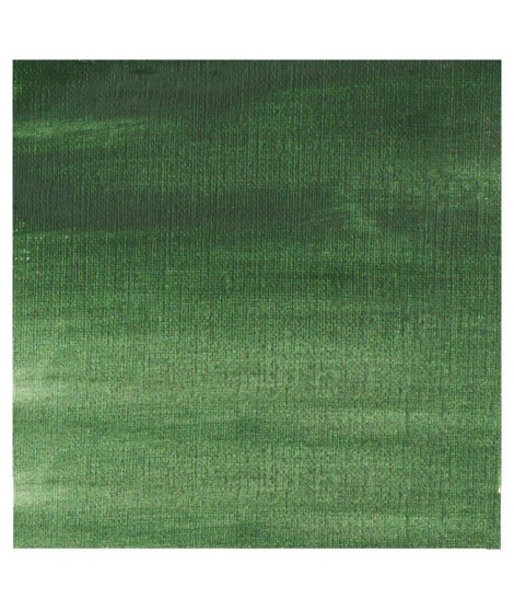
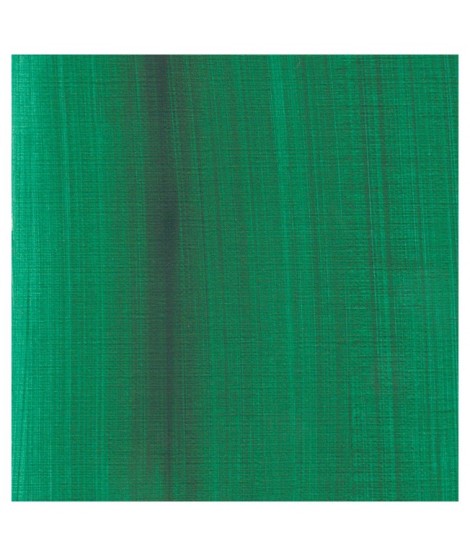
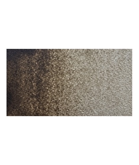
This vivid and strong bluish greens a good staple green to produce a large range of greens.
Active filters
This earthy green is very Opaque.Â
Mixed with yellows or earths (ochre, umber, sienna), it produces a usefull range of greens for the landscapists
It's a deep brownish green.
It's a beautifull green useful in producing glazes when diluted.
This colour is more Transparent and less dull than chromium oxide green. Emerald green produces splendidly luminous green when mixed with cadmium yellow. Landscapists and some portraitists prefer it because his undertone is less vivid than the phtalo green.
This Transparent iron oxyde with a orangey undertone is excellent for producing luminous and warm glazes.
A reddish brown more Opaque and intense than the burnt umber
Magnificent red which turns brown. More transparent than burnt Sienna and less grainy, it can perfectly replace it for watercolorists who prefer a more transparent and reddish tone.
One of the flagship colors at Isaro. Very popular with watercolorists, it is one of the essentials on a palette.
A intense cold brown with a violet shade.
A beautifull warm brown with a yellowish undertone
Very beautiful red, lively and bright with an underlying note colder than Scarlett red.
This very beautiful red whose shade can make one think of madder lacquer does not have the lack of stability over time.
With a little burnt umber, it is perfectly darkened and you easily get a crimson alizarin shade.
Ametrine is a quartz born from the union of citrine and amethyst which gives it very interesting reflections. I was inspired by the color of this mineral to create this purple which joins "other colors of the 2022 "Happy Precious Year" collection.
This color is grainy and iridescent.
Magnificent red which turns brown. More transparent than burnt Sienna and less grainy, it can perfectly replace it for watercolorists who prefer a more transparent and reddish tone.
Very beautiful brown, slightly red. For watercolorists looking for uniform washes, March Brown may be preferred over natural soils.
Ametrine is a quartz born from the union of citrine and amethyst which gives it very interesting reflections. I was inspired by the color of this mineral to create this purple which joins "other colors of the 2022 "Happy Precious Year" collection.
This color is grainy and iridescent.
Very beautiful dark red tending to burgundy.
This very beautiful red whose shade can make one think of madder lacquer does not have the lack of stability over time.
With a little burnt umber, it is perfectly darkened and you easily get a crimson alizarin shade.
Very beautiful red, lively and bright with an underlying note colder than Scarlett red.
One of the flagship colors at Isaro. Very popular with watercolorists, it is one of the essentials on a palette.
This red has a great purity of tone. It draws very slightly on the yellow.
Singular and grainy green color.
Vert Sapin
PG36 + PY165
Very beautiful earthy green and mono pigment.
Green useful for landscapes in particular. Maybe nuanced with phthalo green or yellows.
Based on blue and phthalo green, this turquoise is nuanced at will with blue or green.
Magnificent bright color. Indispensable in many mixtures and in particular to compose, with the blues, a large number of mauves.
With the reds it makes it possible to obtain "cherry red" or "raspberry red" tones.
In my opinion, it is one of the very useful colors on a palette.
Rose navré et légèrement orange
Very beautiful brown with a green shade that characterizes real natural shade earth. I draw attention to the fact that this gray earth is naturally very little coloring.
Dark brown tending to mauve. It can also be easily obtained on the palette by mixing smoke black with mauve iron oxide. To work on its shade, you can add mauve iron oxide to it. By combining it with yellow ocher or natural Siena earth you get sepia brown.