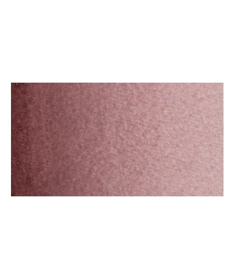
€7.25
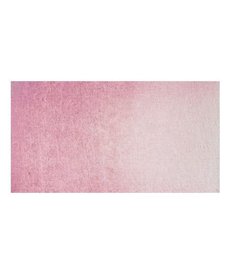
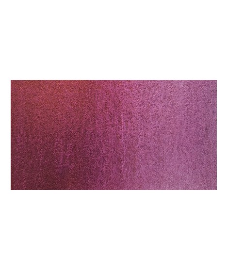
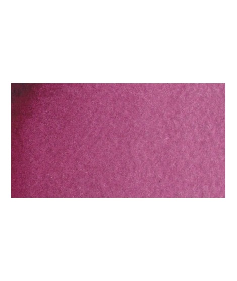
Very beautiful light mauve mono pigmentary and therefore a beautiful purity of tone. It can be lightened with Isaro pink and darkens with ultramarine blue or phthalo blue for example.