
€8.20
Active filters

€7.60

€7.60
A very discreet and interesting pink especially to bring softness to certain floral compositions.
€8.75

€6.55
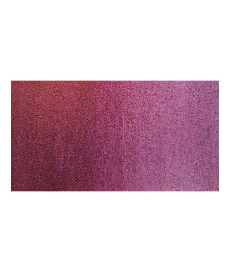
Magnificent bright color. Indispensable in many mixtures and in particular to compose, with the blues, a large number of mauves.
With the reds it makes it possible to obtain "cherry red" or "raspberry red" tones.
In my opinion, it is one of the very useful colors on a palette.

€9.35

€7.25
Based on blue and phthalo green, this turquoise is nuanced at will with blue or green.

€6.55
Very beautiful green, turning blue. When mixed with phthalo blue, it gives a very nice range of turquoises. With the yellows to obtain a very wide range of greens. With the earths of earthy greens and with the burnt umber a dark green.

€6.55
Very beautiful earthy green and mono pigment.

€7.60
Magnificent bright green with an underlying shade of yellow.

€7.25
Vert Sapin
PG36 + PY165

€7.25
€5.45
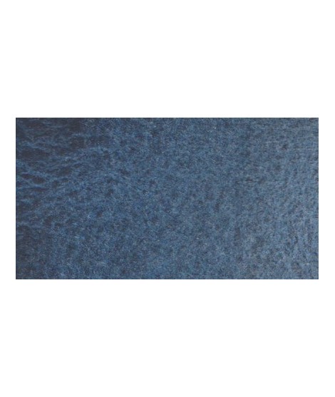
Very nice cold, deep gray, turning blue. Useful as a contrast color.
€5.45
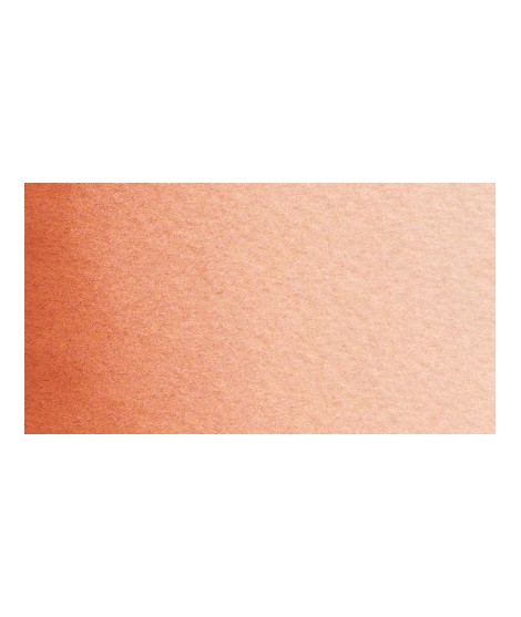
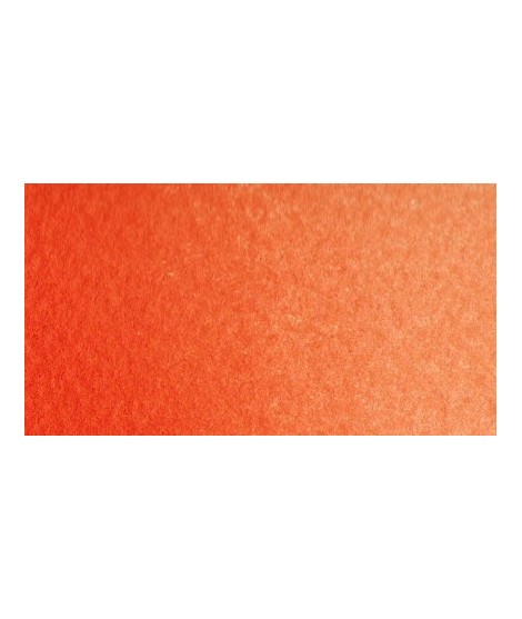
Earthy orange but nevertheless bright.
€7.25
Product available with different options
€8.20
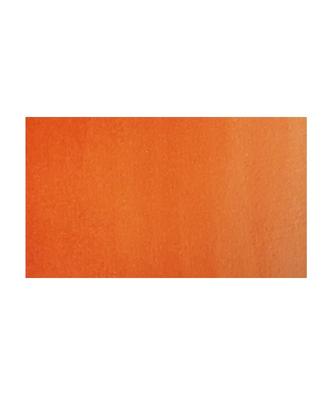
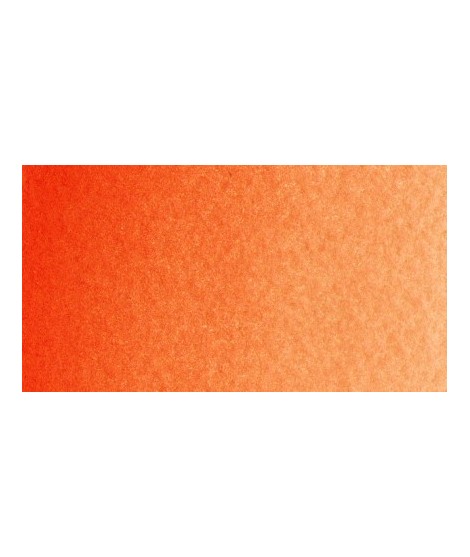
Bright orange. This color is monopigmentary which gives it a very beautiful purity of tone. Due to its greater transparency, pyrrole orange may be preferred.
€7.25
Mono pigment orange which therefore does not result from a mixture of yellow and red which gives it a more excellent purity of tone.