€8.75
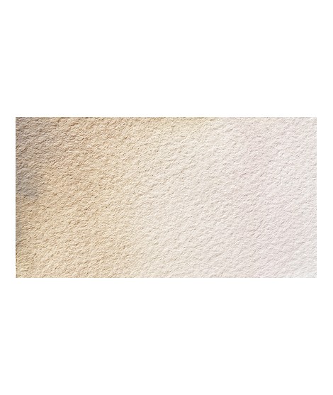
The base of this color is a very soft blue. Diluted well, this color gives a bluish white ideal for painting snow for example.
Active filters
The base of this color is a very soft blue. Diluted well, this color gives a bluish white ideal for painting snow for example.
Beautiful subtle very light gray for light shadows and drapes.
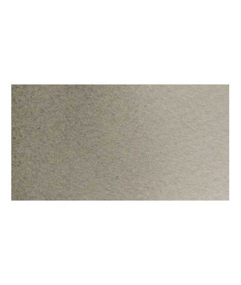
The base of this color is a silver gray.
The addition of a silver pearlescent pigment strengthens the silvery note of the shade and brings to mind a pewter gray.
This red is part of the range of metallic colors. Like all the metallic colors that I have created, its nuance is singular.
Very beautiful dark red tending to burgundy.
This red has a great purity of tone. It draws very slightly on the yellow.
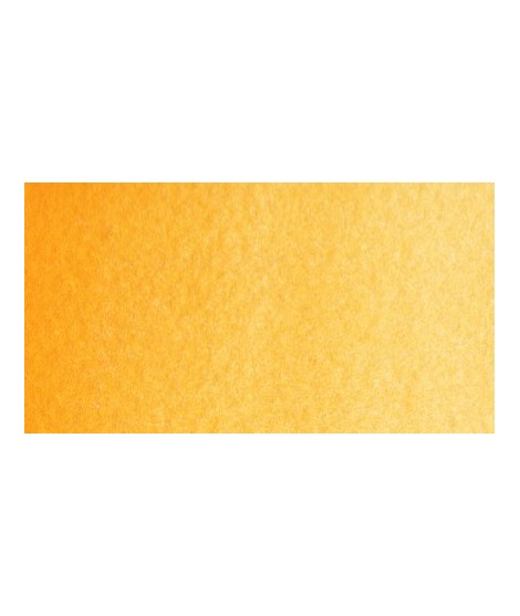
Magnificent yellow-orange very bright and a beautiful purity of tone.
Its more marked opacity than organic yellows (Isaro Yellow light, dark and Indian) can hold back its use, however well mastered it is quite magnificent. It is undeniably one of the colors in my range that appeals to the majority of watercolorists.
Bright yellow with great purity of tone.
Magnificent pale yellow with underlying shade of green, very bright and bright yellow.
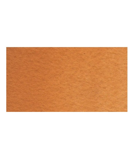
Very beautiful yellow, earthy and bright. Very useful on the palette.
This color is one of the metallic colors that I created to give a little fantasy to the palette of artists who want it.
This black can be useful for certain mixtures. For example, by combining it with ultramarine blue to obtain Payne gray or mauve iron oxide or Venice red to obtain Van Dijck brown, if we add a little ocher we obtain the sepia color.
Very beautiful brick red, with an underlying shade of orange-yellow.
Very good brick red tone, with an underlying pink shade. Despite its relative opacity, this well-mastered color is appreciated by watercolorists.