€8.75
Un bleu à la teinte unique et légèrement iridescent. Il ravira les aquarellistes qui apprécient les effets et la granulation.
Active filters
Un bleu à la teinte unique et légèrement iridescent. Il ravira les aquarellistes qui apprécient les effets et la granulation.
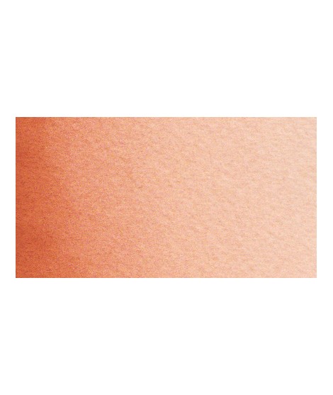
Earthy orange but nevertheless bright.
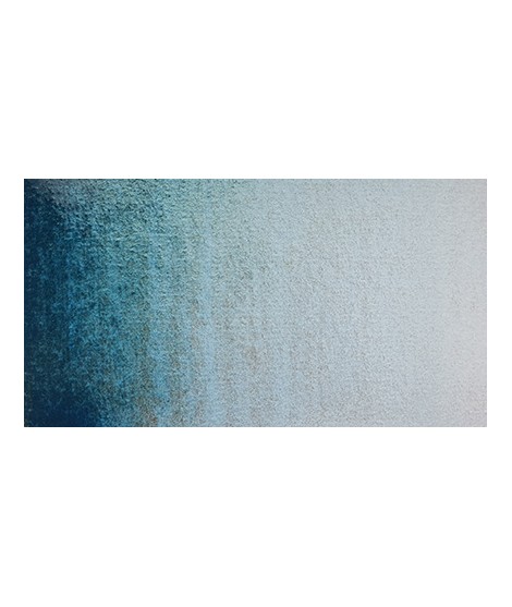
I was inspired by the surprising reflections of a semi-precious stone: apatite.
This blue is grainy and iridescent. It is part of the 2022 Happy Precious Year collection.
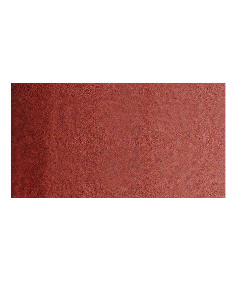
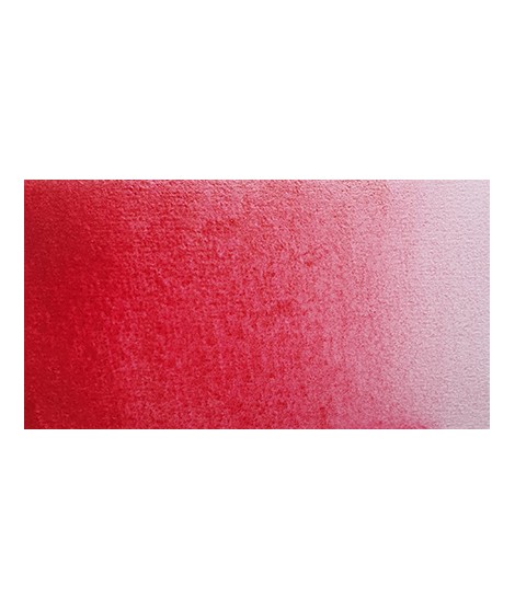
Magnificent red which turns brown. More transparent than burnt Sienna and less grainy, it can perfectly replace it for watercolorists who prefer a more transparent and reddish tone.
One of the flagship colors at Isaro. Very popular with watercolorists, it is one of the essentials on a palette.
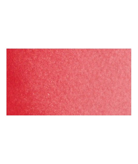
Very beautiful red, lively and bright with an underlying note colder than Scarlett red.
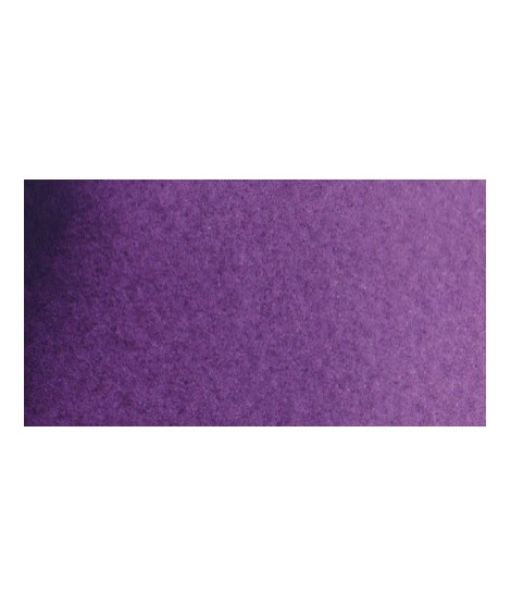
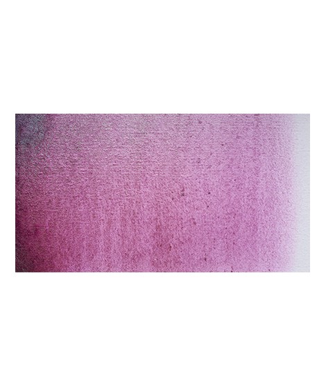
Ametrine is a quartz born from the union of citrine and amethyst which gives it very interesting reflections. I was inspired by the color of this mineral to create this purple which joins "other colors of the 2022 "Happy Precious Year" collection.
This color is grainy and iridescent.
This very beautiful red whose shade can make one think of madder lacquer does not have the lack of stability over time.
With a little burnt umber, it is perfectly darkened and you easily get a crimson alizarin shade.
This red is a very dark red. I find it magnificent in mixture with chartreuse yellow in particular because it forms magnificent autumn tones.
I find that its nuance makes one think of the "old crimson alizarines" of which it does not have the lack of stability.
Ametrine is a quartz born from the union of citrine and amethyst which gives it very interesting reflections. I was inspired by the color of this mineral to create this purple which joins "other colors of the 2022 "Happy Precious Year" collection.
This color is grainy and iridescent.
Magnificent red which turns brown. More transparent than burnt Sienna and less grainy, it can perfectly replace it for watercolorists who prefer a more transparent and reddish tone.
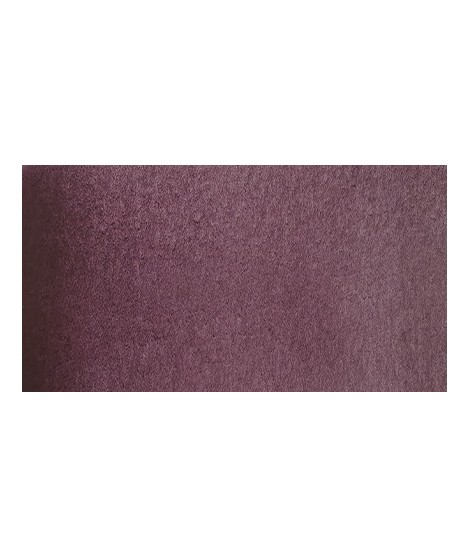
Dark mauve which can be lightened with Isaro pink and nuanced with overseas blue for example.
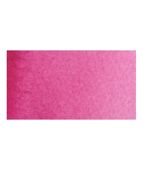
This color can be used as the primary color. It is a bright pink, which forms with the yellows beautiful oranges and with the blue magnificent mauves.
Very beautiful light mauve mono pigmentary and therefore a beautiful purity of tone. It can be lightened with Isaro pink and darkens with ultramarine blue or phthalo blue for example.
Very beautiful light mauve mono pigmentary and therefore a beautiful purity of tone. It can be lightened with Isaro pink and darkens with ultramarine blue or phthalo blue for example.
Dark mauve which can be lightened with Isaro pink and nuanced with overseas blue for example.
This color can be used as the primary color. It is a bright pink, which forms with the yellows beautiful oranges and with the blue magnificent mauves.
Ametrine is a quartz born from the union of citrine and amethyst which gives it very interesting reflections. I was inspired by the color of this mineral to create this purple which joins "other colors of the 2022 "Happy Precious Year" collection.
This color is grainy and iridescent.
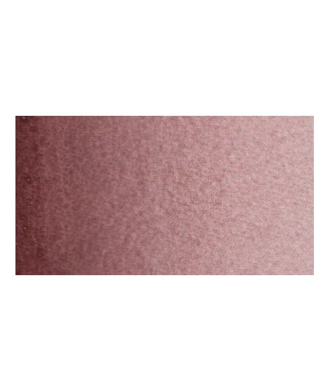
Your dark purple tending to brown. Pure it is of an interesting tone. It also comes in composite colors like sepia brown or Van Dijck brown.
I was inspired by the surprising reflections of a semi-precious stone: apatite.
This blue is grainy and iridescent. It is part of the 2022 Happy Precious Year collection.
Un bleu à la teinte unique et légèrement iridescent. Il ravira les aquarellistes qui apprécient les effets et la granulation.
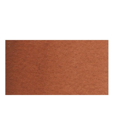
Very beautiful brown, slightly red. For watercolorists looking for uniform washes, March Brown may be preferred over natural soils.
Gorgeous unique shade of gray blue.
Ametrine is a quartz born from the union of citrine and amethyst which gives it very interesting reflections. I was inspired by the color of this mineral to create this purple which joins "other colors of the 2022 "Happy Precious Year" collection.
This color is grainy and iridescent.
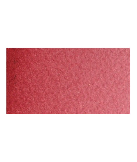
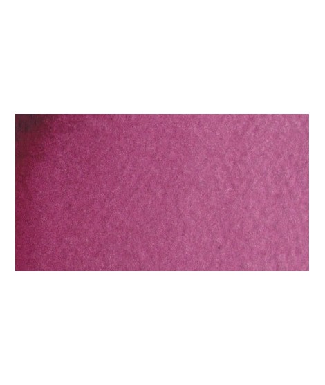
Very beautiful dark red tending to burgundy.
This red is a very dark red. I find it magnificent in mixture with chartreuse yellow in particular because it forms magnificent autumn tones.
I find that its nuance makes one think of the "old crimson alizarines" of which it does not have the lack of stability.
This very beautiful red whose shade can make one think of madder lacquer does not have the lack of stability over time.
With a little burnt umber, it is perfectly darkened and you easily get a crimson alizarin shade.
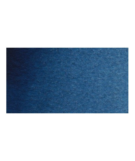
It is a dark blue, which corresponds to a dark reddish blue. It is ideal for nuancing cool colors like violets and blues by giving them more depth. Also useful for forming greens, especially with chartreuse yellow.
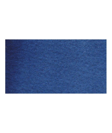
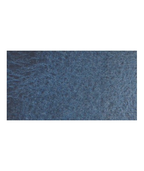
Dark blue with an underlying green hue. This blue is very useful for creating greens, it is actually the blue of greens.
Very beautiful red, lively and bright with an underlying note colder than Scarlett red.
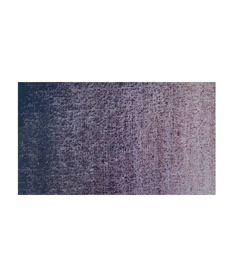
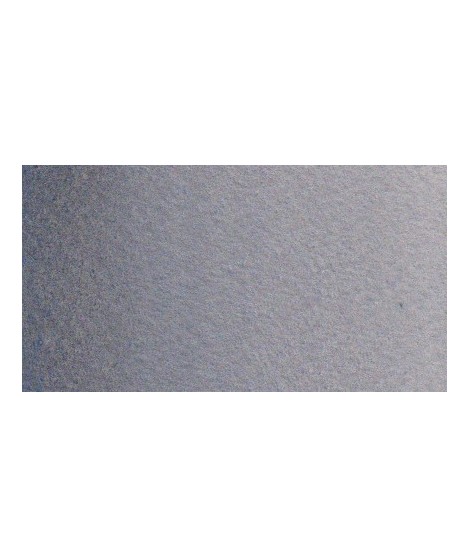
Very nice cold, deep gray, turning blue. Useful as a contrast color.
One of the flagship colors at Isaro. Very popular with watercolorists, it is one of the essentials on a palette.