keyboard_arrow_down
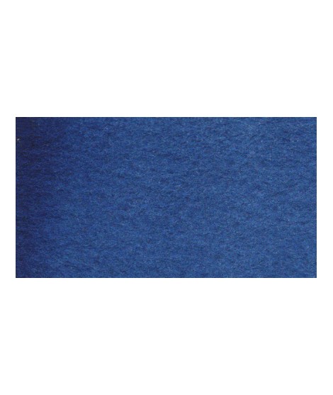
It is a dark blue, which corresponds to a dark reddish blue. It is ideal for nuancing cool colors like violets and blues by giving them more depth. Also useful for forming greens, especially with chartreuse yellow.

It is a dark blue, which corresponds to a dark reddish blue. It is ideal for nuancing cool colors like violets and blues by giving them more depth. Also useful for forming greens, especially with chartreuse yellow.
I really care about who my colors are for. If I do this job it is above all not to satisfy customers or gain market share but to satisfy artists. So I hope that they can be seduced by the power of the colors and their brightness.