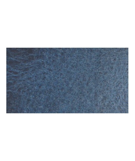


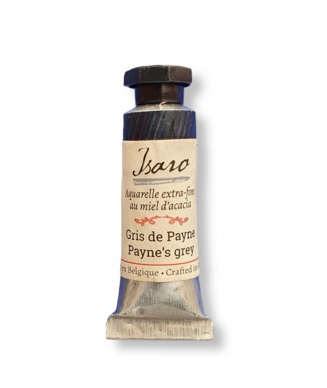
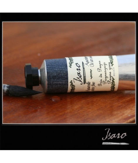
Very nice cold, deep gray, turning bPayne’s Grey - A Textured Grey
PBK11 + PB29 + PB15 - Opaque - Granulating
This hue, due to its harmonious nature and mixing potential, remains a top choice for watercolorists seeking refinement and delicacy in their compositions. It allows for subtle contrasts, making it ideal for working on stormy skies, nocturnal landscapes, and creating atmospheric gradients.lue. Useful as a contrast color.
Payne’s Grey is an essential shade, valued for its versatility and subtlety. With a dark, slightly bluish tone, this grey offers an elegant alternative to black, providing depth without the overwhelming harshness often associated with pure black. Created in the 18th century by British painter William Payne, it was initially designed as a mixing color to replace the excessive use of carbon black. It quickly became a favorite among artists for its richer, more vibrant undertones, ideal for capturing subtle shadows and textured atmospheres.
Payne’s Grey stands out for its excellent lightfastness.
Combine it with warm yellows like Indian Yellow or Saffron Yellow to create soft, autumnal greens. Pair it with a deep red such as Pyrrole red deep for plum tones or warm shadows. It can also be nuanced with Ultramarine Blue for cooler effects. When blended with natural earth tones like Burnt Sienna, it produces neutral or slightly brownish greys, perfect for landscapes.
I really care about who my colors are for. If I do this job it is above all not to satisfy customers or gain market share but to satisfy artists. So I hope that they can be seduced by the power of the colors and their brightness.