keyboard_arrow_down
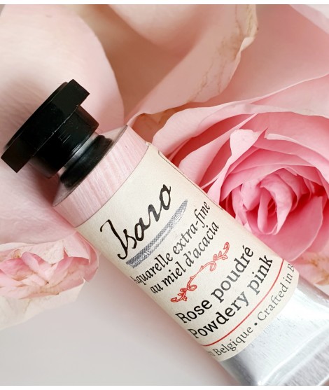
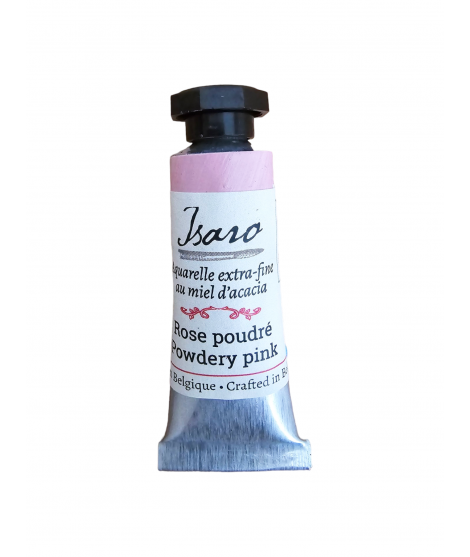
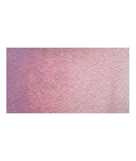
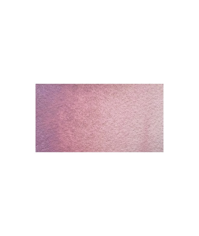
Powder Pink – Softness and Elegance
PR122 + PW6:1 – Opaque – Non-granulating
Powder Pink is a delicate and refined shade, perfect for adding a touch of softness and subtlety to watercolor compositions. Inspired by the pastel hues of flower petals or the velvety feel of antique fabric, this slightly muted pink is ideal for romantic atmospheres and gentle light effects.
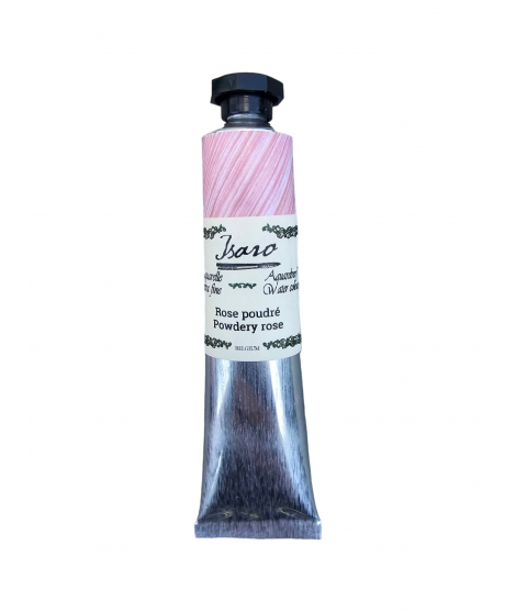
Powdery rose is a delicate and refined shade, perfect for adding a touch of softness and subtlety to watercolor compositions. Inspired by the pastel hues of flower petals or the velvety feel of antique fabric, this slightly muted pink is ideal for romantic atmospheres and gentle light effects.
Powder Pink – Softness and Elegance
PR122 + PW6:1 – Opaque – Non-granulating
Powder Pink is a delicate and refined shade, perfect for adding a touch of softness and subtlety to watercolor compositions. Inspired by the pastel hues of flower petals or the velvety feel of antique fabric, this slightly muted pink is ideal for romantic atmospheres and gentle light effects.
I really care about who my colors are for. If I do this job it is above all not to satisfy customers or gain market share but to satisfy artists. So I hope that they can be seduced by the power of the colors and their brightness.