keyboard_arrow_down
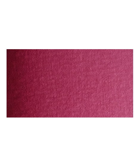
Quinacridone Carmine - A Radiant Pink
PR202 - Transparent - Non-granulating
Quinacridone carmine provides a deep, rich hue that is both luminous and transparent, perfect for creating intense effects and subtle nuances in watercolor works.
Quinacridone Carmine is a vibrant and translucent hue that captivates with its luminosity and purity. This pigment, part of the quinacridone family, is known for its intense color, very similar to Isaro pink, evoking the delicate shades of flower petals. Its history dates back to the 1950s, when it was developed to replace less stable organic pigments, offering a more reliable and durable alternative. In watercolor, quinacridone carmine is prized for its excellent transparency and its ability to create subtle gradients. It is ideal for portraits, landscapes, and botanical illustrations.
When mixed with light Isaro yellow or Indian yellow, quinacridone carmine can produce beautiful peach or coral tones. When combined with cooler shades like ultramarine blue or phthalo blue, it creates vibrant violets.
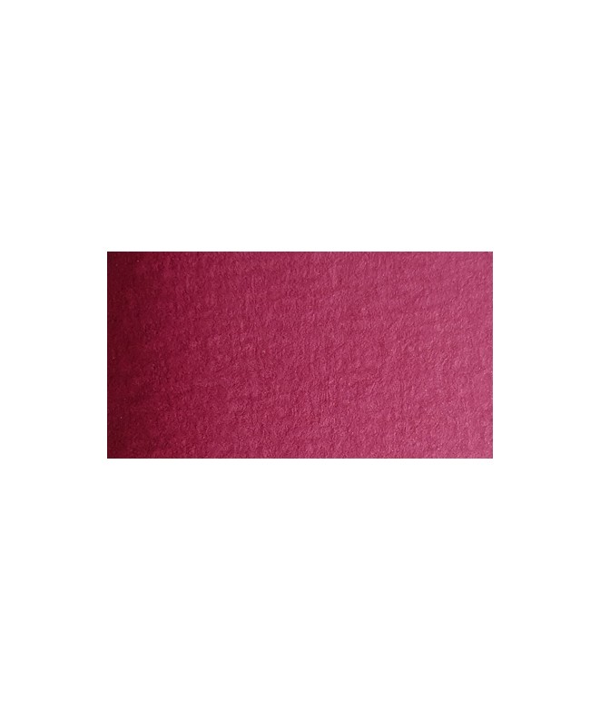
Quinacridone Carmine - A Radiant Pink
PR202 - Transparent - Non-granulating
Quinacridone carmine provides a deep, rich hue that is both luminous and transparent, perfect for creating intense effects and subtle nuances in watercolor works.
I really care about who my colors are for. If I do this job it is above all not to satisfy customers or gain market share but to satisfy artists. So I hope that they can be seduced by the power of the colors and their brightness.